EDIPT Model
BON VOYAGE
Bon Voyage is a mock iOS trip planner mobile app that facilitates location based city tours, excursions & restaurant reservations for the user. The mobile app allows users to plan for upcoming trips by summarising information about the user’s destination in several categories such as day plans, reservations and things to do.
Bon Voyage was my first UX/UI design project, making it the opening chapter in my journey to becoming a professional product designer. My goal was to learn what it meant to have a design process. Throughout the project, I made connections between the digital product I built and my experiences designing experimental research. As I learned my own process, I discovered my time as a web designer/developer profoundly influenced my work, helping me become the product designer I am today.
PROJECT
BON VOYAGE APPLICATION SOLUTION
- Role - UX/UI Designer
- Tools - Sketch, Marvel, InVision,
- Timeline - 6 Weeks
- Key Deliverables - Domain research, Competitive analysis, User personas, User journey maps, Information Architecture, Paper prototyping, Concept testing, Usability testing, Mid-fidelity wireframes, App Map, inVision prototype

APPROACH
THE APPROACH THAT I FOLLOWED
I applied the design thinking methodology (EDIPT) by the Hasso Plattner Institute of Design at Stanford (the d.school) . This method allowed me to cut through the complexity of user-centred design. I decided to use this method as it gave me the big picture of the user experience development, from strategy and requirements to information architecture and visual design.

EMPATHISE
DISCOVERY PHASE
I started with the very first stage of the design process. I wanted to gain an empathic understanding of the problem that was trying solve and this involved discovering different types of way we could conduct our research.
I wanted to focus on identifying who the users are, understanding their needs, motivations and behaviours. To begin my design process, I first had to empathize with my users by conducting the following methods of research;
- Competitive Analysis
- Domain Research
- User Interviews

Competitors
COMPETITIVE ANALYSIS
From my research, I found out that technology plays a very vital role for businesses in the travel industry and their customers. It has the capacity to improve the customers experience as well increasing the efficiency of business operations.
The competitive analysis showed that different applications connected travellers with local and expert recommendations but only a few of them promoted in-the-moment discovery. The popular apps felt basic when it came to providing the users’ needs and they didn’t feel like they would connect to the unique experiences that the modern-day user requires.
DOMAIN RESEARCH
As I was investigating the domain of mobile, and online experiences, I found it useful to supplement my competitive analysis with another form of research. I conducted a quick Google search to learn more about the travel sector. I wanted to know what the emerging trends are, whether travel is on the rise or if the market is saturated. It was very important for me to know whether going mobile-first is really the best option for my product.
17%
of travellers have taken a trip on their own in the last year
66%
of travellers prefer to use the smartphones rather than their desktops, for travel research
85%
of travellers use mobile specific Apps such Booking, Yelp etc to search for accommodations and excursions.
78%
of travellers heavily engage with their social media followers
60%
of the respondents said that they use navigation maps while travelling while
54%
of the travellers look for restaurants and events while travelling.
USER INTERVIEWS
The interview subjects are in their 30’s and they are either married or in a relationship. I discovered that the users had the following travel behaviours:
- They try to save as much money as possible when they travel and they try to find deals.
- They want to engage with the locals and get to live through their shoes.
- They all like to read reviews and look at the pictures before they purchase any products or visit any new locations.
- They all plan/arrange ahead 2-4 months for their travels. This allows them to set up a solid itinerary.
- The travellers find inspiration for their travels on Instagram, Facebook and other travel websites such as Reddit, Lonely Planet, The New York Times, Foursquare and travel blogs.
DEFINE
WHO IS THE USER?
The user interviews that I conducted painted a very clear picture what Bon Voyage needed to solve for its users, and in doing so, who the typical user would be. I used the data from the research to create a persona for Bon Voyage, Michael. Michael allowed me to stay on track throughout the design process.

User Persona
PROBLEM STATEMENT
After combining my understanding of the users goals and frustrations with market and domain research, I determined the opportunity and problem that Bon Voyage needed to solve for. I synthesised the data from my research and formulated the product problem statement; I used this as a guide during the brainstorming and concepting phase.
The modern spontaneous traveller needs a convenient and cost-effective way to travel to new destinations and be fully informed & immersed in the culture of the country that they are visiting because that would make their trips/holiday much less stressful and more enjoyable.
USER STORIES
I created potential scenarios in which Michael used Bon Voyage and utilized his stories to create a foundation for feature requirements.
As an explorer, I would like to spend every minute of my travels enriched in the culture of the specific destination because that would help me understand their culture.
As a diet-restricted eater I need to be able to easily find restaurants that cater to my diet needs when I travel because I wouldn’t have to eat bland foods.
As an adventurer, I would like to be able to find as many excursions as possible because that would make the trip more enjoyable.
As a consumer, I need to be able to compare prices and read as many genuine reviews when before I purchase anything because I would then be able to buy the right product/service for me.
As a budget-conscious traveller, I would like to be able to find package deals, track and project my finances because I would like to save as much money as possible.
As an experience-driven millennial, I want to track the places I discover so I can visit and share them with my friends and family.
By crafting situations in which the user wants help while wandering allowed the planner in me to see through his yes. Through creating these narratives, I developed a better understanding of the user’s other problems and how he might use Bon Voyage to solve them.
DESIGN PRINCIPLES
Identifying current processes helped me to narrow in on the problem that I wanted to solve, as well as define what design principles my solution should incorporate.
INTUITIVE
The product needs to be very intuitive so that the users can quickly be able to find the information that they are seeking.
INSPIRING
The experience should feel inspiring by showcasing and suggesting experiences and excursions based on similar interests.
HELPFUL
The experience should feel helpful by showcasing useful historical information and maps/directions on how to access the sites.
CONVENIENT
The product needs to have user profiles to store the users profile and payment information, past purchases, past search history etc.
INFORMATIVE
The product needs to be very informative so that the users can quickly be able to find the information that they are seeking.
PERSONALISED
The experience should feel personalised by showcasing the relevant restaurants, excursions, events, historical sites etc.
INTUITIVE
The product needs to be very intuitive so that the users can quickly be able to find the information that they are seeking.
INSPIRING
The experience should feel inspiring by showcasing and suggesting experiences and excursions based on similar interests.
HELPFUL
The experience should feel helpful by showcasing useful historical information and maps/directions on how to access the sites.
IDEATE
BRAINSTORMING & ITERATING
After coming up with a solid foundation of potential requirements for the product and an understanding of Michael’s wants and needs, I dove into the concept brainstorming. I used the 6-8-5 method to rapidly iterate on my ideas and drew interaction design from other products like Airbnb, Google Maps, Facebook etc.

6-8-5 Sketches
APPLICATION MAP
After I tested the iterated the paper prototype, I proceeded on to the next step which is creating the information architecture to have clear idea of how these ideas/concepts could be converged.The logical application of how different screens and areas of the app relate was very helpful as it allowed me to simplify the complex information.
Application map

PAPER PROTOTYPE
Wanting to quickly mock-up my product for the purpose of validating with the users, I chose to rapid prototype. Doing this rapidly and iteratively allowed me gain feedback from my peers early on before going into a full build of the Bon Voyage app.
Paper prototype
LOW-FIDELITY WIREFRAMES
I wanted to visualise the users experience when using the Bon Voyage app. By creating wireframes, I was able to establish what goes where, without consuming too much time on aesthetics. The wireframes also allowed me to experiment and work out visual problems without spending too much time on the pixels.

Low Fidelity Wireframes
VISUAL DESIGN
The analytical nature of market and domain research felt somewhat familiar to me as I had to apply the same methodologies when writing university reports. It was very interesting to examine the look and feel of the applications in terms of colours and typography as well as interaction patterns and branding. This opened my eyes to design research and showed me that my analytical background would help me become a better and informed product designer.

Visual Competitive Analysis
MOOD-BOARD
Before I started creating the style tiles, I explored the visual design of my app. I collected visual inspiration on Pinterest for things that inform my visual direction. The mood-board included typography, colour pallets, UI layouts, symbols, icons, photography and anything else that evoked the style direction I was going for.

One of my mood-boards
STYLE TILE
I focused on two of Michael’s influences: exploringnew cities and getting immersed in unique experiences. Connecting these back to his desire to feel local and immersed within new travel locations, I created the following two divergent visual directions.

Style Tile
PROTOTYPE
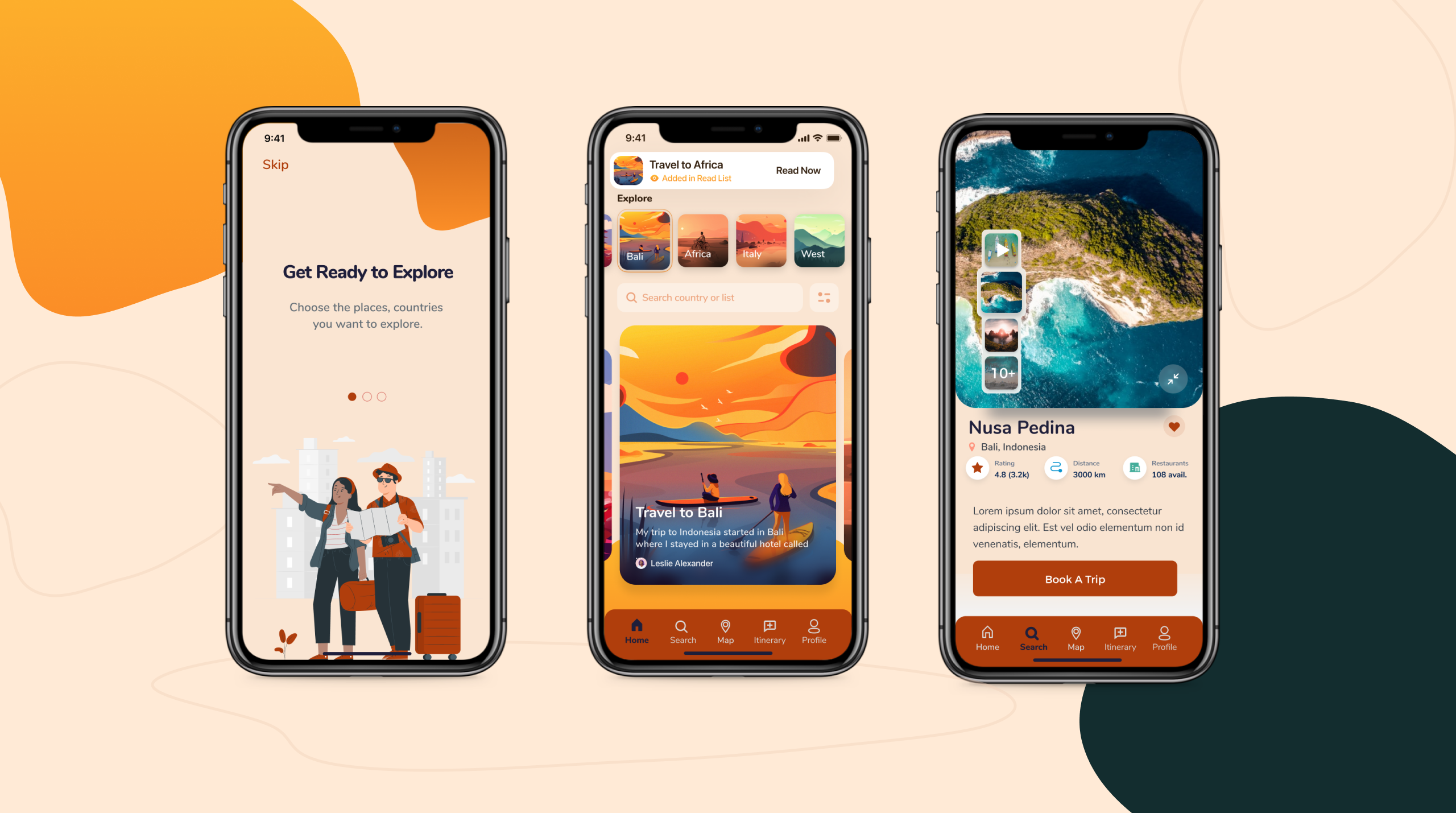
HIGH-FIDELITY SCREENS
I created and iterated high-fidelity screens. After feedback, I refined my designs to improve white space, decrease gradient usage, and clarify typography hierarchy. These changes improved alignment with the best mobile practices and created a more balanced look and feel.


High Fidelity Screens
HIGH-FIDELITY PROTOTYPE
Once I finished making my high-fidelity screens, I created a clickable prototype in InVision for a first-time user. The main goal of this prototype was to solve the persona’s (Michael) problems that I had identified during the research synthesis phase of this project. I created all of the necessary screens for these flows and did a rough user testing with my peers where they were able to critique these screens prior to jumping into usability testing. View the prototype on the video below or by clicking on the button.
Mid-Fidelity Prototype
TEST
USABILITY STUDY FINDINGS
I conducted this user testing to ensure that I am headed on the right path with the design of the mobile app that the potential end-user is satisfied with Bon Voyage’s specified use-context. The main purpose of the test was to assess the usability and general effectiveness of the Bon Voyage App while it is still in development.
The list below shows the tasks that the participants were asked to perform and their results;
- Create a new account – 100% of the participants were able to navigate easily and create a new account.
- Use the ‘Discover’ feature – 75% of the participants were able to easily find the navigation bar and stated that this was a nice feature to have on the app.
- Select a preference and add it on the itinerary – 50% of the participants were able to successfully perform this task.
- Open up the map and search for a location – 100% of the test participants were able to successfully use the map feature.
- Search for city specific experiences – 25% of the participants completed the task successfully without the interviewer’s guidance.
- Access the profile settings – 100% of the participants were able to successfully navigate to the profile settings.
Most of the participants found the Bon Voyage app to be well designed, clean, uncluttered and easy to use. Finding an app that can support all of their travel needs is very important to them. Implementing all of the participant’s suggestions and recommendations will continue to iterate so that we can ensure that the end product will be a fully user-centered app.
RESULTS
WHAT DID I LEARN?
Bon Voyage was an important lesson in the dangers of excessively using features. I got really excited by the insights and concepts that I tried to converge too many ideas into one application. The result of this was overly complex Information architectures and user flows that were redundant. I learnt a lot from this experience and I applied these lessons into my next project.
My design thinking skills grew immeasurable over the six weeks that I worked to create Bon Voyage. I was challenged to separate my self from the user and I learnt the value of research as both an empathy and data building tool. I also learnt the value of crafting tools like personas, user stories, and style tiles that helped me to keep my focus on the user.
Watching my concepts evolve from messy drawn sketches to seeing real people click my high-fidelity prototype ignited my passions for building digital products.
